As I write this, our clients have a mix of Office versions deployed. Some corporations are still using Office 2003, while many others have taken the Office 2007-2010 plunge and been “Ribbonized”. The most difficult are the companies that have a mix of both. This platform mix is most challenging when PowerPoint is the target program. This is because of the different way masters and layouts are used.
PowerPoint has 2 layout mechanisms: the master and the layout. Masters are customizable pages that contain graphics and text that are in common to all slides. Layouts are arrangements of text and graphic placeholders that are superimposed on the master to make the final slides. PowerPoint 2003 opened up new possibilities for presentation design by adding multiple masters. Instead of just 1 master each for slides and titles, you could now create different masters for different purposes. This made it much easier to create a presentation with varying sections and special-purpose slide designs.
In PowerPoint 2003, you access the masters using the View>Master>Slide Master command. Masters display in a sidebar, where you can create rename, duplicate and create masters. You can create a slide master or a slide/title master pair, but a title master cannot exist on its own. The primary difference between a slide and a title master is that the slide master has a multi-level text placeholder, while a title master has a subtitle placeholder with only one level of text.
There are 2 problems in PowerPoint 2003, though. First, Microsoft’s user interface design for accessing these masters is counter-intuitive and hard to use. And second, slide layouts are still closed to customization. This lack of customization means that multiple master slides are often necessary to create all the slide designs that may be needed.
When Office 2007 came out, the program that was most improved was PowerPoint. In addition to long-missed features like tracking/kerning and a more discoverable user interface, Microsoft had finally made slide layouts customizable.
To access masters and layouts in PowerPoint 2007-2010, click on the View tab of the Ribbon. Then click on Slide Master in the Presentation Views group. The master is the larger thumbnail at the top. The layouts are the 11 automatically generated slides below it. Not all of these are useful. The layouts you will probably reuse are the Title Slide, Title and Content and Section Header layouts, immediately under the master. The Title Only and Blank layouts at positions 6 and 7 are also widely used.
The shift in emphasis from masters in PPT03 to layouts in PPT07 means that creating a presentation template for PowerPoint 2003 is very different from later versions. In PPT03, all customization has to be packed into the masters. In PPT07, masters become much less relevant, with most customizations built into the layouts. Multiple master slides are only necessary to use a different Color Theme, since each Master and its Layouts can only use one color theme at a time. This is a change from 2003, where each slide could have a different Color Scheme applied.
As far as support goes, a PowerPoint 2003 presentation with multiple masters will almost always require an extra tutorial. This must explain masters, layouts and their application, because Microsoft’s interface is so bad. PowerPoint 2007 usually needs only a sample presentation that shows how the different layouts are used.

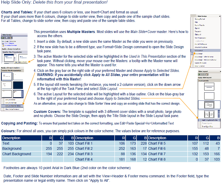
Content from a typical tutorial slide. Multiple Master presentations in PowerPoint 2003 need this information to make them useable.
The scenario that will having you tearing out your hair is the “blended family of Office versions” client who has both Office 2003 and 2007 users. These clients often believe Microsoft’s hype about 100% cross-compatibility between Office versions. PowerPoint is not totally compatible. Masters, slide layouts, charting and color palettes are all different. Behind the scenes, Microsoft has implemented eye-rolling kludges to simulate compatibility. Let me repeat: PowerPoint is not totally compatible!
In fact, the only program where we will not upgrade an older 2003 file to a newer version is PowerPoint. Instead, we rebuild it. If you’re creating a presentation that uses palette-switching to create sections with different color schemes, there is no other possible workflow. It’s the only way to guarantee it’s going to work correctly for the long term.
The best scenario is when the client is using PowerPoint 2007 or better. Compared to earlier versions, the new PowerPoint is a delight to work with and finally offers the capabilities that designers have been assuming were there all along.


