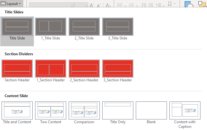
One of my areas of expertise is to do presentation assessments for designers, finding any potential problems in their work before sending their file to their client. Something I see fairly often is multiple slide masters in a template or theme, where they are used as an organizational tool. Typically, one master will be for title slides, another for section headers, and so on. This is a poor practice, but it goes on because designers never have to actually use the files they create. If they did, the problem would soon become evident. Here’s a typical example:
Multiple Slide Masters: Beware! – Best Practices
Multiple Slide Masters – How They Work
If I asked you “How does PowerPoint know which slide master to use when there is more than one?”, what would your answer be?
Well, I’ve done the research, so I can let you know. When you paste slides into a presentation, PowerPoint looks at the slide immediately preceding the paste position and uses the slide master for that slide. If there are no slides in the presentation, then PowerPoint uses the first slide master. This has major consequences for the format of the pasted slides. If the slide master of the preceding slide has only title layouts, only the pasted title slides will find their rightful layout. All the rest of the slides will bring their old layout with them. So now the slide master for titles has a whole bunch of non-title layouts. Oops. So much for your organizational scheme. Following are the original slides, followed by what they look like when pasted after slides based on different masters:
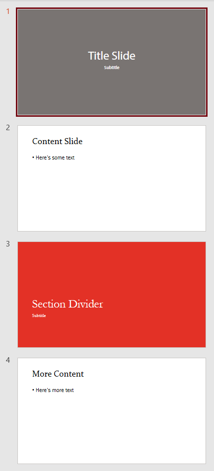
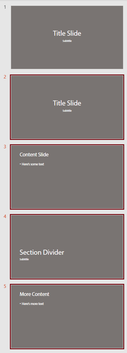
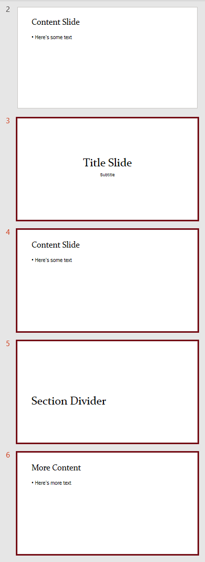
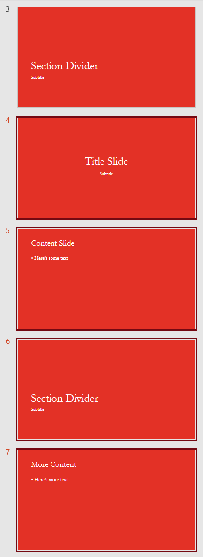
If the pasted slides are from legacy presentations, where the intention was to update them to the new look, you get a total fail. Not only do they not update, they’ve ruined the new deck with added old layouts. The next time the user adds a new slide and tries to find a layout in that slide master, they get a psychedelic soup of designs.
But wait! It gets worse! For some bizarre reason, designers have a bad habit of deleting all the placeholders on the slide master, then building the design in the layouts. Ouch! The placeholders on the slide master are parents to the child placeholders on the layouts. They are the source for font and paragraph formatting in layout placeholders, as well as the default placeholder positioning. When you paste slides so they use that blank slide master, formatting goes haywire. The slide layouts that get imported with the pasted slide have no source to tell them how to display content. PowerPoint makes a guess and always guesses wrong. Bold text becomes regular, font sizes changes, pictures disappear. It’s a nightmare, and one that designers just don’t understand, can’t explain to their clients, and have no idea how to fix.
A Better Approach
The simplest is to just use a single slide master. In 99% of presentations, one slide master is all you need. That slide master should be formatted as closely as possible to look like a typical content slide. Then for layouts that have different formatting, right-click on the layout background and choose Format background. In the Format Background task pane, check the option for Hide background graphics. Then place the alternate graphics on that layout.
About the default placeholders: keep them! Deleting the default placeholders does nothing helpful and can cause problems. If someone pastes a slide with a footer and your layout doesn’t have a footer placeholder, the footer text will reposition itself, often at the very left edge of the slide, because the content has been orphaned. If your design doesn’t include a footer, move the placeholder off the bottom of the layout! This makes a pasted footer simply disappear instead of looking weird.
Multiple Slide Masters – When and How to Use Them
You can use multiple slide masters for organization of slide types as long as each slide master is identical. An easy way to ensure this is to create all your slide layouts under a single slide master. Then duplicate that slide master and delete the layouts not needed. So you might end up with 2 identical slide masters, one that has all the title and section divider slides, then another that has all the content slides. As long as the slide masters are the same, mixing and matching will not create any problems.
There are other viable uses for for multiple slide masters. One is when a presentation requires multiple color themes. Some organizations have divisions that use code colors: a key color that is used only in that group. Under the slide master, create the complete set of layouts needed for the presentation. Set the code color in Accent 1 if it’s a predominant element of the client branding. If it’s a subtle design change, Accent 6 is better. Get the client to sign off, so the design is not going to need a lot of future revisions. Then copy and paste the slide master for each code color required. Finally, revise the color theme for each slide master, changing only the accent color. Following this method, every slide master has every layout. The worst that can happen is someone pastes in the wrong place and the code color is off. Easily fixed.
The other time you need multiple masters when a client has rolled out a new template, then realizes they need to handle legacy slides. Then you create a second slide master with layouts that match the new look but have a layout structure that is compatible with the old decks. At the beginning of the deck create 2 sample slides, one based on the new slide master and another based on the legacy slide master. Place a notice to the user just off the edge of the slide master for the first slide: “New slides only! Don’t paste old slides!” and on the second “Paste old slides here! No new ones!”. Then users are less likely to paste slides in the wrong spot and get weird results.

Extremely helpful! I would LOVE to solve this challenge when pasting from one PPT to another – the colors shift, so I choose “Keep Source Formatting” which causes all those old masters to join the party. GRR. Any advice?
This problem can be solved when designing the new presentation that will receive the old slides. A new template can be made 100% paste-compatible with the old files. Here’s my article explaining how to do this: Legacy Slides – Best Practices.
The color shift problem is caused by using a different color theme. To avoid any changes, you would have to use the same color theme in the new template as was used in the old decks. If the old slides don’t have to be interactive, you could export them as pictures, then place those pictures in the new deck.
John, you are AMAZING, thank you so much!! (PS I actually never expected a real person would answer, so this is doubly amazing!) – taryn