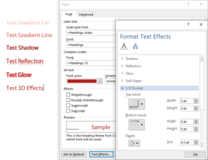
The Best Practice is to NOT use Text Effects in Office. Ever.
That could have been my shortest article ever, but I guess I should explain the reasons. I’m referring to the graduated fills and lines, the glows, reflections, shadows and 3-D effects you can add to text. In the past these effects have caused some problems with ordinary shapes, but with text, they’re a disaster.
Clearly, it’s not enough for most users that these effects are visually hideous. That just a natural result of the low value we assign to arts education. In many years of working with competent graphic artists, I’ve never been asked to create any template that uses these effects. Designers understand the need for restraint, users don’t. And so we get the appalling appearance of most Word and PowerPoint documents.
But the functional problem with these effects is how they affect PDFs created from Word, PowerPoint and Excel. Microsoft has no clue how to export true PostScript of the fancy effects. So they adopt a simplistic approach: flatten them to graphics. Unfortunately, this means the text vanishes, leaving behind only a pretty picture. Well, not even that. All kinds of PDF functions are impaired: Text to speech is impossible, accessibility goes right out the window, reimporting the PDF to Office is brain-dead.
I tested PDFs created in 3 ways: saving to PDF in Office, printing to Acrobat and printing to the Microsoft Print to PDF print driver that comes with Windows 10. When saving to PDF, all text with applied effects was flattened. When printing to either Acrobat or Microsoft Print to PDF, Gradient Fills, Gradient Lines and 3D Effects were flattened, while Shadows, Reflections and Glows remained as live text.
The moral is clear: when the client asks for Text Effects, just say NO!


